Why Your Website Isn't Converting Visitors Into Clients

Why is my website not converting visitors into clients?
Most websites fail at conversion because of strategy problems, not design problems. The five most common reasons are: visitors cannot tell who you help, the website explains what you do instead of what the client gets, there are too many options with no clear next step, the site does not build enough trust, and the website is not connected to the rest of the business ecosystem. A converting website clearly communicates who you help, what problem you solve, and what the visitor should do next.
There is a particular kind of frustration that comes from having a beautiful website that does not actually bring you clients.
You invested in the design. You chose the colors carefully. You wrote the copy (or paid someone to write it). You launched the site, told your community, and waited for the inquiries to arrive.
And waited.
The website looks professional. It may even have won you compliments. But the people who visit it are not becoming clients. They are not booking calls. They are not joining your email list. They are not taking the next step.
The problem is rarely that the website is ugly. In fact, many of the most beautiful websites I have reviewed for Gen-X women entrepreneurs are also the least effective at converting visitors into clients.
Beauty and conversion are not the same thing.
A website can look stunning and still fail to do the one job that actually matters: helping the right person understand what you do, trust that you can help, and take a clear next step toward working with you.
What Does It Mean for a Website to Convert?
A website converts when it moves a visitor from passive browsing to intentional action. That action might be booking a call, joining an email list, applying for a program, purchasing an offer, or sending a message.
Conversion is not about tricking someone into buying. It is about clarity. When the right person arrives on your website, she should be able to quickly understand three things: who you help, what problem you solve, and what she should do next.
If any of those three are unclear, she leaves. Not because she does not need help, but because the website did not make it obvious that you are the one who can provide it.
Most websites fail at conversion not because they lack visual appeal but because they lack strategic clarity. The design is doing its job. The strategy underneath the design is not.
Reason 1: Visitors Cannot Tell Who You Help
The most common conversion problem I see is a website that speaks to everyone and therefore speaks to no one.
The homepage says something like, "Helping you create a life and business you love" or "Empowering women to step into their potential." Those phrases sound nice, but they do not help a visitor determine whether the business is for her.
A woman arriving at your website is usually carrying a specific problem. She may be overwhelmed by her business systems, confused about her offers, exhausted by the mental load of running a business while managing a family, or unsure whether her website is doing its job. She needs to know, within a few seconds, whether you understand that problem.
If your website uses language that could apply to almost anyone, the right visitor will not recognize herself. She will assume the business is not specific enough to help with her particular situation, and she will leave.
The fix is not to sound formulaic. It is to be useful. Instead of "empowering women," try something like, "I help Gen-X women entrepreneurs simplify their businesses so they can grow without sacrificing the lives they are building."
That sentence tells the right person she is in the right place. It also tells the wrong person she is not, which saves both of you time.
Reason 2: The Website Explains What You Do Instead of What the Client Gets
Many service-based websites are structured around the business owner rather than the visitor.
The homepage says, "I am a certified coach with fifteen years of experience." The services page lists modalities, credentials, and methodologies. The about page tells the founder's story in detail.
All of that may be true and valuable, but the visitor is not primarily looking for your biography. She is looking for help with her problem.
She wants to know: What will change for me if I work with you? What outcome can I expect? What does the process look like? How will I feel differently after this is handled?
A converting website leads with the transformation and supports it with credibility. It says, "Here is the problem you are experiencing. Here is what it looks like when it is solved. Here is how I help you get there."
Your experience matters, but it matters most when it is connected to the result the client wants. "Fifteen years of experience" is not as compelling as "I have helped over 200 women simplify their businesses and reclaim their time."
Reason 3: There Are Too Many Options and No Clear Next Step
A website that offers six different services, three free resources, two newsletters, and a podcast may look impressive. But from the visitor's perspective, it creates decision paralysis.
When someone is unsure what to do next, she usually does nothing.
This is the same principle I teach about simplifying your client journey. A website should not be a menu of every possible option. It should be a pathway with a clear next step.
For most service-based businesses, that means one primary call to action. If the visitor is ready to buy, the path is obvious. If she is not ready yet, there is one clear way to stay connected—usually an email list tied to a useful resource.
Every additional option competes for attention and dilutes the likelihood that the visitor will choose any of them. A website with one clear invitation will almost always outperform a website with seven.
Reason 4: The Website Does Not Build Trust
Trust is the bridge between interest and action. A visitor may understand what you do and see a clear next step, but if she does not trust that you can deliver, she will not take it.
Trust is built through several elements working together: clear messaging that demonstrates you understand the problem, evidence that you have solved it for others, content that shows how you think, and a professional presentation that signals competence.
Many websites skip trust-building entirely. They jump straight from "here is what I do" to "book now." The visitor has not had enough exposure to your ideas, approach, or results to feel confident making that leap.
This is where content becomes a conversion tool, not just a marketing tool. A blog post that articulates the visitor's problem better than she could herself builds immediate trust. A case study or testimonial that shows a real result demonstrates that your approach works. An about page that connects your experience to her situation creates a sense of "this person understands me."
Trust does not happen in a single moment. It accumulates as the visitor moves through the site. But if the site does not provide enough substance to build that trust, the call to action will feel premature.
Reason 5: The Website Is Not Connected to the Rest of the Business
A website is not a standalone object. It is part of a larger business ecosystem that includes your email list, social media, content, offers, and client experience.
Many websites fail to convert because they exist in isolation. The social media drives traffic to the homepage, but the homepage does not connect to the content. The content does not connect to the offers. The offers do not connect to a clear way to buy or inquire.
When the pieces are disconnected, the visitor experiences the business as fragmented. She may see a great Instagram post, click through to the website, and land on a homepage that feels like a completely different business.
A converting website creates a seamless path from every entry point. Social media leads to relevant content. Content leads to the email list. The email list nurtures the relationship. The offers are clear and connected. The next step is always obvious.
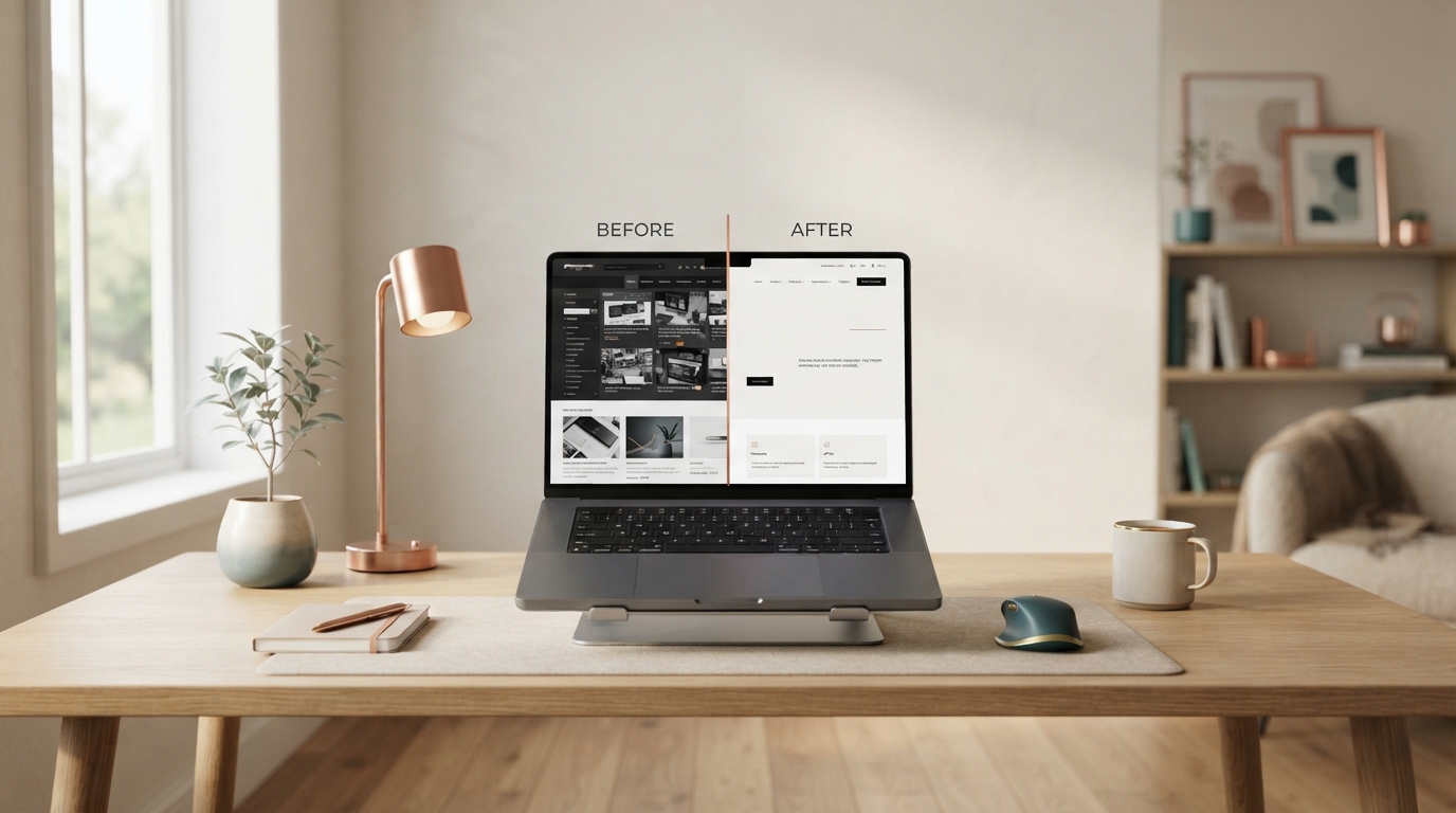
This is what I call a Website Glow-Up: not just making the site prettier, but making it work as the central hub of a business that actually converts.
What a Converting Service Business Website Should Include
A service-based business website does not need to be complicated, but it does need to answer specific questions clearly and quickly.
Within the first scroll: Who you help, what problem you solve, and what the visitor should do next.
Within the first page: Evidence that you understand the problem, a sense of what working with you looks like, and enough trust-building content to make the call to action feel natural.
Within the site: A clear services or offers page, an about page that connects your story to the client's needs, content that demonstrates your expertise, and one primary call to action that appears consistently.
Behind the scenes: A way to capture email addresses, a follow-up sequence that nurtures the relationship, and analytics that tell you where visitors are coming from and where they are dropping off.
If any of these pieces is missing, the website will underperform regardless of how beautiful it looks.
AI Is Changing What Websites Need to Do
The role of a website is shifting as AI tools change how people search for and discover businesses. A website is no longer just a digital brochure. It needs to be a clear, structured, authoritative resource that both humans and AI engines can understand.
This means your content needs to answer real questions, your structure needs to be clear enough for AI to parse, and your messaging needs to establish you as the obvious authority in your space. A website that does this well will become more visible in both traditional search and AI-generated answers.
If your website is not doing this, it is not just missing conversions today. It is losing visibility for tomorrow.
The Fastest Way to Know if Your Website Is Converting
Ask someone who has never seen your business to look at your website for fifteen seconds and then tell you three things: who you help, what problem you solve, and what she should do next.
If she cannot answer all three, the website is not converting as well as it could, no matter how beautiful it is.
The good news is that conversion problems are fixable. They are usually strategy problems, not design problems. The design may need to support the strategy better, but the strategy has to come first.
If you suspect your website is not doing its job, I can help. Through The Business Blender, I help Gen-X women entrepreneurs turn their websites from beautiful but silent into clear, strategic, conversion-ready business hubs.
Bring me the mess. We'll blend it into a website that actually works for your business.
About Heidi Totten
Heidi Totten helps Gen-X women build profitable, soul-aligned businesses with clearer offers, simpler systems, stronger strategy, and fewer moving parts. She writes about business strategy, websites, AI, technology, sustainable growth, and the practical decisions that help experienced women create more impact without creating more chaos.